Design Tokens, the answer for more sustainable digital projects
Designers and developers are increasingly interested in joining forces to develop sustainable digital products. To do this, they will focus primarily on the experience by modulating the elements of an interface. The result is greater productivity and, above all, higher quality.
Today, the structure of a product using Design Tokens is making more and more headlines. Until now, this method has been used mainly by large companies such as Salesforce, Adobe and Google. It borrows codes from manufacturers with a view to rationalising and optimising elements of the production chain.
But what is a Design Token?
To define what a Design Token is, I'm going to use a physical object as an example: a computer keyboard.
Raw values
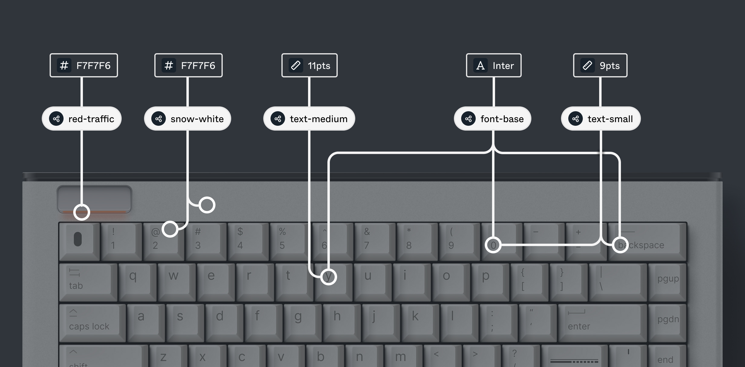
A keyboard is made up of several elements such as the letter keys, the space bar, the shift key, LEDs, etc. These elements, which we will call components, have specifications that can be reused to facilitate their design, for example "4cm" or the colour "#FFFFFF". These are raw values that production programs will be able to use.
Shareable values
Each of these components has shareable values with the others. These values are named to make them clearer, for example the raw value "#FFFFFF" will be named "white" or the dimension "4cm" will be "size-xl". In the case of a keyboard key, the colours, typography, rounding and dimensions are values shared with other components of the keyboard.
Values responding to use cases
To avoid all the components of our keyboard being too different, each one will be assigned shared values responding to a use case. Do the alphanumeric keys share the same colours as the keyboard background? What colours are used for the default LEDs depending on their status? Are there two font sizes?
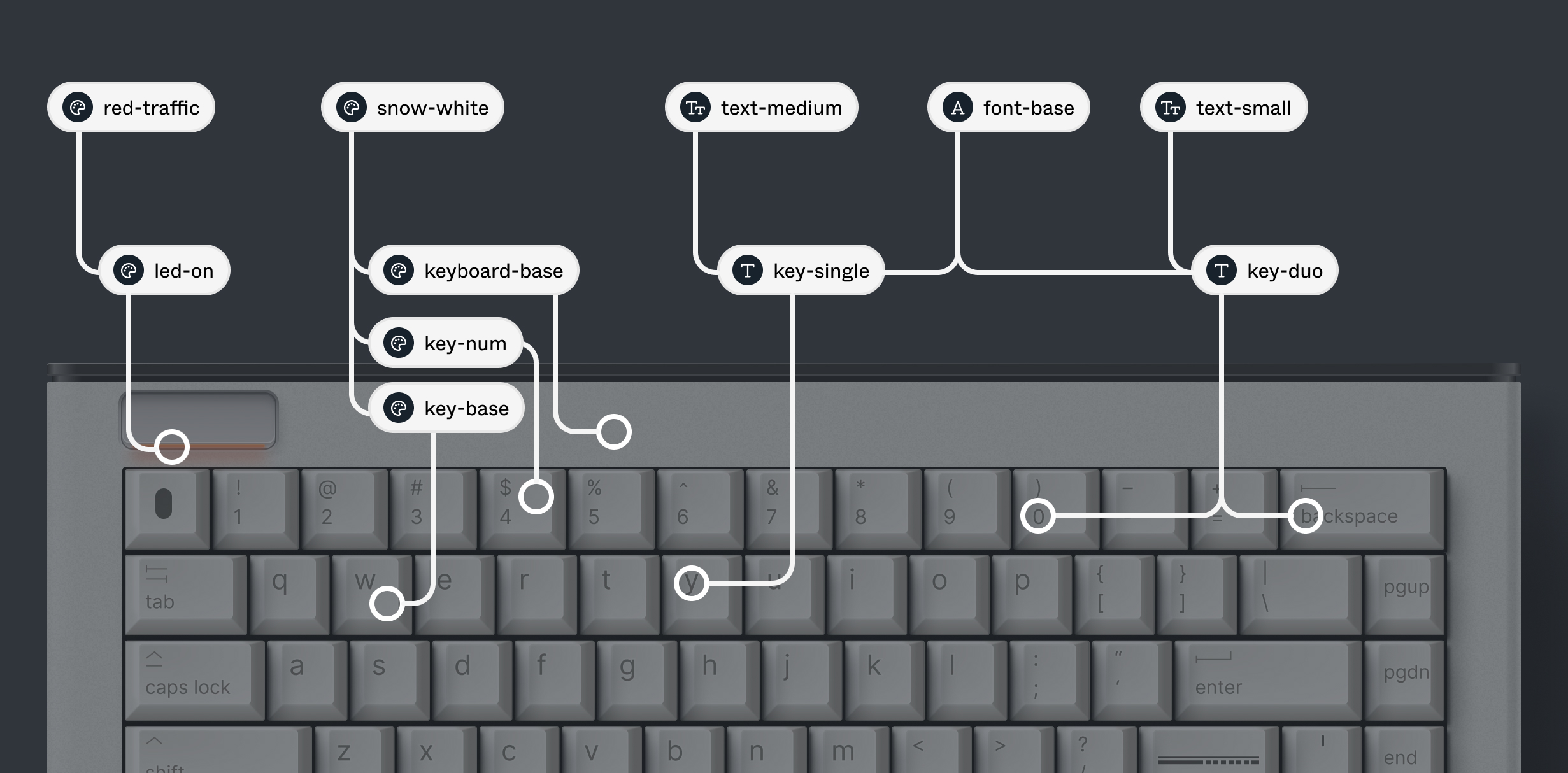
These values are used to separate the component from shareable values. In other words, in the case of a keyboard, this would make it possible to quickly update its specifications without modifying the whole. For example, if the numeric keys need to be blue, it will be easier to assign them a value that suits their use without changing the colour of all the keys. This also opens the door to the possibility of creating variations of the product!
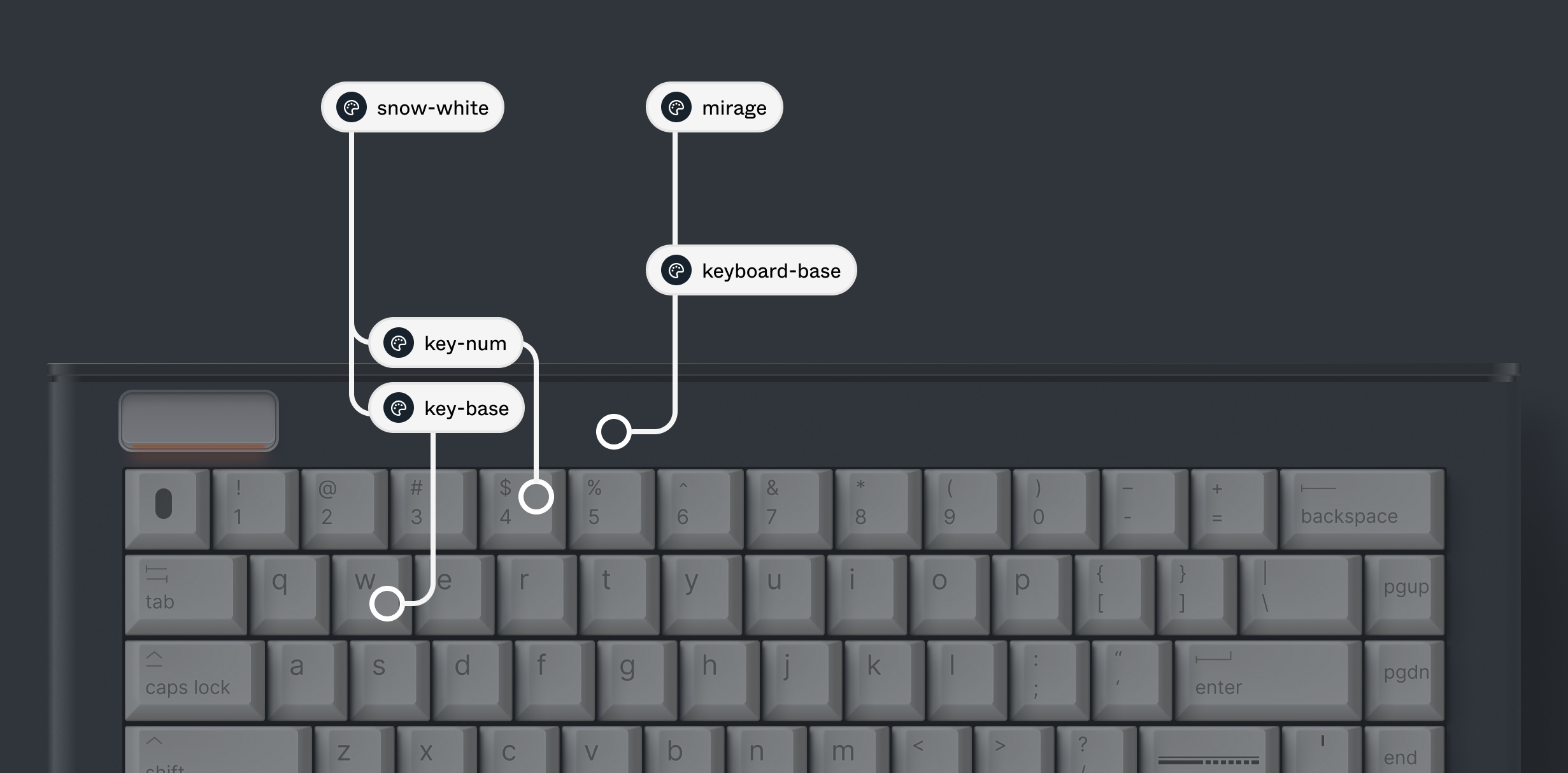
Values for relative needs
Certain keys sometimes have different characteristics depending on their use, so they need their own values, specific to relative needs.
The space bar will be so wide, but it borrows the same height as all the other keys. The shift key has an LED which lights up in a different colour to the others, and it will also have two different states.
These cases are then entered separately, but can borrow certain values shared by the others! But be careful, these relative values must be present in the raw values.

And applied to interfaces?
You may have noticed that the previous example allows you to separate your composition into at least three levels (raw values, shared values, values responding to use cases). Relative values can be treated in a number of ways and remain fairly specific to use cases; it is not always essential to have them, depending on how a component is designed.
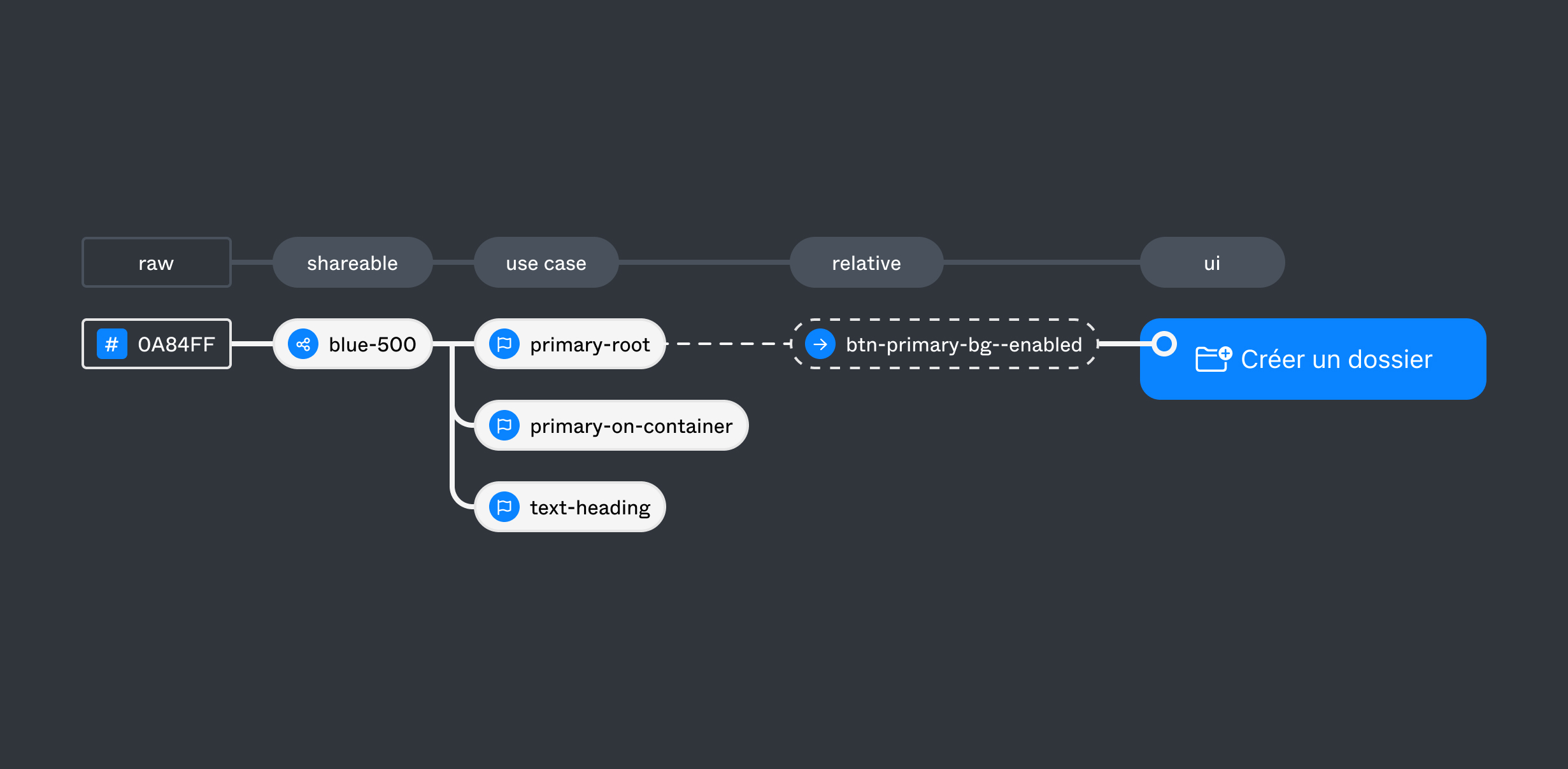
If I take these levels and break down a button into text and an icon, it's possible to assign specifications in the same way, with colour, numeric, textual, typographic, state and animation values.
| Type | Raw Values |
|---|---|
| Colours | #0A84FF #0974E0 #FFFFFF |
| Sizes | 4 8 12 16 24 32 40 48 |
| Font | Inter |
| Font Weight | 500 800 |
| Type | Shared Value |
|---|---|
| Colours | blue-500 : #0A84FF blue-700 : #0974E0 white : #FFFFFF |
| Incremental | 1 : 4 2 : 8 3 : 12 4 : 16 6 : 24 8 : 32 10 : 40 12 : 48 |
| Typography | font-base : Inter text-normal : 500 text-emphasized : 800 text-base : 16 line-height-base : 24 |
| Font Weight | 500 800 |
| Type | Value responding to use cases |
|---|---|
| Surfaces | base : white |
| Semantic / Primary | root : blue-500 root-hover : blue-700 on-root : white |
| Spacings | tight : 2 regular : 4 loose : 8 |
| Sizes | xs : 6 sm : 8 md : 10 lg : 12 |
| Text Style | inter-base-normal : font-base, text-normal, text-base, line-height-base inter-base-emphasized : font-base, text-emphasized, text-base, line-height-base |
All these values can then be applied to our button... but also to other components!
What are the advantages of this approach?
Quality and productivity are the two main advantages of designing sustainable products using Design Tokens. Provided the tokens are correctly implemented through well-defined decisions and use cases.
Quality, because the people in charge of design will be able to make clear decisions throughout the creation of the components, harmonising the elements of a product more easily, but also several products together thanks to the centralisation of values. What's more, developers will be better able to integrate these decisions, as they are communicated thanks to a common base (the tokens) and so anticipate the placement of the tokens in the components.
Productivity, because there are fewer questions to ask once the values have been decided. Developers no longer need to guess at the designers' intentions. It's also possible to export all the data to the developers, reducing the duplication effort and also making maintenance of the product more fluid and optimised.
Teams can then concentrate on more important tasks, such as creating new features and improving the user experience.
When should this method be used?
All the time. Using Design Tokens helps to reduce errors during the design and development process, for example: looking for the action colour... finding it in the product mock-ups... checking that the colours are correctly applied to all states... oops, that was the colour used for the logo... but where is the right colour? This example is no longer necessary if there are tokens thanks to its common base.
Note that it is also important to involve the design and development teams from the outset in order to synchronise the tokens used.
In summary
Using Design Tokens has several advantages for design and development teams, improving consistency, collaboration, quality and maintenance of one or more products. What's more, it complements the design of a Design System !


