Web eco-design: our tips for creating sustainable digital experiences
Today, it is essential that companies take into account environmental issues in their digital strategy, especially when designing digital products.

The consequences of digital technology on the environment are real and it is important to do our best to reduce our impact. This is why, as web professionals, we have the responsibility to reduce our ecological footprint. This includes web eco-design, an approach that aims to design websites in a more energy-efficient and environmentally friendly way. In this article, we offer you several tips to optimize the carbon footprint of your website.
#1 User experience as a lever for sustainable web design
The UX (user experience) is an essential step in eco-friendly web design. It is the first step in creating a website that is not only effective for users, but also environmentally friendly.
Define the need accurately
In order to create a lasting digital experience, understanding user needs is essential. Approximately 45% of the requested features are never used, and 70% are not essential. Defining the user’s needs is therefore a crucial step and must be done by involving end users.
To properly define your users' needs, it is important to:
- learn from your target audience, identify the characteristics and behaviors of your end users. Through interviews, discussions or data analysis, you can establish typical personas for your website.
- Identify needs, by interviewing your target users, you will be able to precisely list their expectations in terms of features, content or needs.
- prioritize the needs, once the list of needs has been elaborated, it is important to assign them a level of importance. This allows you to focus on the features that will have the strongest impact on the user experience without overloading your website.
Adopt a mobile first approach
Mobile first means designing for mobile devices first, then adapting the design for larger screens. This allows you to focus on the essentials while avoiding the accumulation of features that do not correspond to the expectations of users or the goals of the website itself. Mobile first is all the more important as 54% of web pages are viewed on mobile.
Simplify the user experience
The time users spend on your website and the number of actions or interactions they perform can affect the environmental footprint. A non-fluent experience often has a high environmental footprint. Check the number of steps required to complete a user journey action.
In other words, by having a user-centered approach to sustainable web design, we can create websites that meet the real needs of users, while being environmentally friendly.
#2 Media optimization for your website
GIF format vs mp4
As seen in our previous article: The environmental impact of the web in numbers, media represent the vast majority of the internet's weight. GIFs are popular on the web, yet there is no advantage to prefer them to video, in terms of performance and eco-design. Two criteria play an important role when talking about media on the web: quality, weight. The paradox of the GIF is that, despite its very high weight, it has a lower quality than a video.
.png)
For the test, I took a GIF image with a weight of 4.34Mb, converting it to mp4 video makes it 0.66Mb, that's a weight gain of 85%.
Accumulating too many heavy videos/Gifs on a website impacts the carbon footprint. The key is to minimize their use. In addition to the ecological aspect, there will also be a gain for the SEO. The larger the file size, the longer it takes to load the file and render it on the web page. The longer the time, the worse the performance. The worse the performance, the worse the Crawl Budget will be (moreover). The crawl budget is an important factor for SEO. According to Gary Illyes, it is the number of URLs that the Googlebot can and will crawl.
Do we really need so many animations?
Widely used on web pages, we find them on many elements of the websites we browse. A CSS animation can be very greedy in terms of CPU cycles. Moreover, it requires development skills to be implemented and to get the perfect rendering you want. Finally, it needs to be tested in every browser you want to support.
The mp4 format, on the other hand, uses almost no CPU. However, the size of the file must be taken into account. In addition to that, some manipulations will be necessary to make it behave like an animation on a web page.
In summary, to limit consumption, it is essential to use animations only when they have a significant impact on the user experience.
Image compression
Resizing, compressing and choosing the right format are as important as the profitability of the posted media.
Resizing is imperative to limit data transfer, a 1700px wide image in a 1200px tag is clearly a waste of bandwidth. It is necessary to resize the image either directly via the framework used if it allows it, or using a software.
For compression, 2 methods are possible:
- Lossless, without quality loss, less efficient, the idea is to remove the unnecessary metadata from JPEG and PNG files. It is possible to recover the original image from the compressed one.
- Lossy, more efficient, but with an irreversible loss of quality.
The choice of format depends on the type of image and its use:
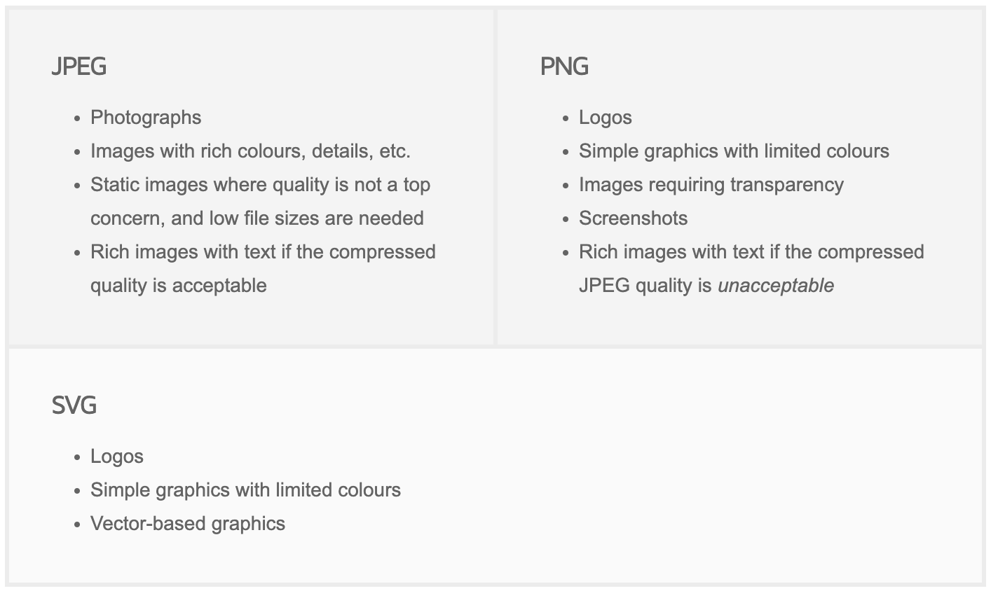
Choosing the wrong image format can negatively impact the visual aspect of your website. For example, when using a logo, it is necessary to choose an SVG format. In addition to being lightweight, SVG is a vector image format that maintains its quality regardless of its size. To compare, I converted an SVG image to a PNG with a density of 300 pixels per inch. The file size almost doubled, but the quality remained optimal in SVG, unlike PNG.

Google has created the webP format to replace the standard formats. The goal is to make the bandwidth used by the images profitable, by decreasing their weight by 25 to 34% according to Google, with or without quality loss (lossy, lossless as seen previously) with a better compression profitability than PNG and JPEG formats.
However, despite the advantages in terms of image quality and file size, this format is not widely used. This may be due to compatibility issues, availability in image processing software and user preference for the more familiar and widely used existing formats.
#3 The use of lazy load
This is a pattern designed to delay the loading of an element or object until it is requested. It is only when a user scrolls through the DOM elements on a web page until a certain threshold, that the element is loaded. The advantage of lazy load is the progressive loading of the media, which is only done below the waterline. In contrast, with eager load, all images are loaded synchronously, including those that are not (yet) visible for the user, which affects the loading time, and energy consumption. For your website, all media must be lazy load, including iframe.
Lazy load can also be used on queries, but unlike media, it should be avoided. The main difference between eager load and lazy load, is that eager load allows you to get all the data with the data of the relation(s) in a single request. Whereas lazy load requires the main query, plus the one(s) for the relation(s), to get the main model and the relation data. In short, for the same result, a single query (eager load) is better than a collection of queries.
In conclusion, by avoiding lazy loading queries, you gain speed and therefore energy efficiency. Note that some frameworks offer the possibility to throw an error when requests are made in lazy load.
#4 Choosing a Green Host
Data centers need to operate 24/7, so that we can access all websites and other digital services at any time. Of course data centers consume energy, emit heat, and therefore must be continuously cooled to stay at 20 degrees (on average). Thus, cooling is also an energy consumption. Not to mention all the CO2 released into the air during its design: extraction of raw materials, manufacturing, transportation, waste, etc.
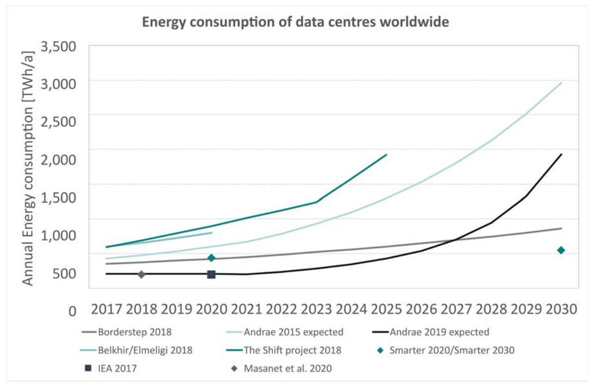
On our scale, the solution we have is simple: choose the right host.
Choose a green host, a host that uses good practices such as :
- offsetting the carbon footprint,
- the use of more efficient cooling systems,
- the reuse of heat, especially for district heating,
- software virtualization, optimal use of server capacity,
- eco-design for infrastructure efficiency,
- the use of renewable energy to power data centers,
- building data centers in cold climate regions.
#5 Fonts: Self-host vs CDN
There are quite a few opinions on the issue in terms of performance. The missing argument for the CDN (Content Delivery Network) being control, as quoted in the sia.codes article. But overall, the performance gain of hosting the fonts versus using a CDN differs primarily from the chosen host. An article on Theme Fusion summarizes the choice in part "If your website is on an extremely slow host, prefer using a CDN for your web fonts, otherwise prefer using local mode.”
.png)
However the choice remains important, because the performance gain can be enormous as this graph shows, in red self-hosting, in blue CDN. There are also solutions to limit the fonts loaded to those used.
#6 Limit unused storage space
A simple solution, at our scale, to limit the energy consumption of data centers, but also of our own devices: empty the unused storage space. An initiative is set up to bring this movement: the Cyber World Cleanup Day.
Cyber World CleanUp Day (or Digital cleanup day) is a day to raise awareness about the environmental footprint of digital technology through action, which has taken place every year in March since 2018.
For example: an email (~10g of CO2) has the same carbon footprint as a low-energy light bulb turned on for 3 hours. An easy action to implement is to block the senders of unwanted emails. All these actions put together can have a real impact if we all get involved.
Geneva has joined the movement by creating the Geneva D-Tox Day.
Conclusion
In a world where digital technology is omnipresent, it is crucial to take into account the environmental impact of our online activities. Web eco-design is an approach that responds to this need by proposing solutions to make websites more sustainable and ethical. This article was written with the idea of providing an initial overview of the principles of web eco-design, including energy efficiency, resource conservation and ethical web practices. It is an invitation to continue this collective reflection and to integrate these principles into our web projects for a more sustainable future.
